
Brand Education

Somewhere along the way I realized that my clients and I don’t always speak the same language.
With one of my goals being clarity on both sides at all times, I knew I had to create a resource that helps bridge my most common communication gaps.
Some of these terms are vague, some are specific. Some are widely recognized, while not all are industry standard. There’s not always a right or wrong way to approach these terms, but below is the language I most frequently use to describe my services.
These look different from project to project, but they can be anything from symbols, to little illustrations, textures, patterns, or even photos! The cloud image at the top of the page? I consider this a brand element. View this highlighted project for a better example of brand elements.

Brand Element Example 1

Brand Element Example 2

Brand Element Example 3

Brand Element Example 4
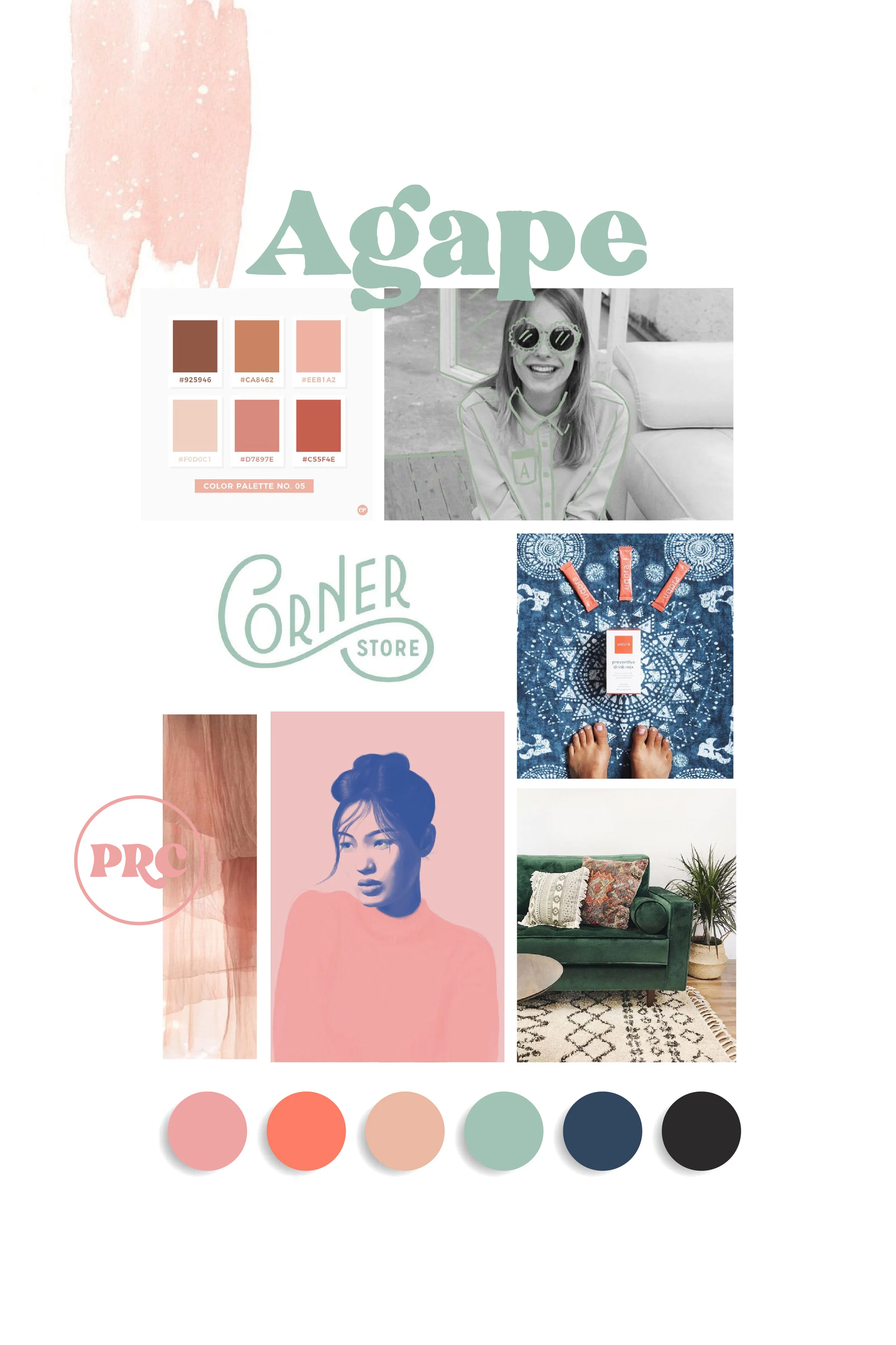
A color palette is a determined selection of colors used in a project. While a logo-specific color palette may be 2-3 colors, my color palettes are built for a full brand and generally contain 5-10 colors. I like to finalize color palettes in the Visual Discovery phase of a branding project and I often include them in the moodboard. A color palette should be consistent throughout a brand to ensure the brand integrity remains strong. The more a color palette is used effectively, the stronger the brand reinforcement.

Meden Studio’s Color Palette
A domain name is the name of a website, ie: www.meden.studio Domains may be purchased and managed through a registrar service. I recommend GoDaddy to my clients.
The cute little (teeny tiny) icon next to a URL at the top of a webpage! When left unattended, Squarespace has a predetermined favicon that looks like a grey box. It’s universal to Squarespace sites and very obvious when it isn’t customized. The most recent Squarespace update considers this symbol a “Browser Icon,” which honestly...makes a lot more sense than the former tried and true term.
Main Logo, Secondary Logo, Horizontal Logo, Stacked Logo, Submark...Why do I need so many logos?!
It may seem like a lot, but a complete logo suite often comes with a few variations of a Main Logo. These variations ensure that the logo will fit well in the variety of spaces it may be displayed. For instance, a client may use their main logo in the header of their website but use a submark or a horizontal logo in the footer. Below is Meden Studio’s logo suite.

Main Logo

Submark

Horizontal Logo
A solid moodboard is the goal of a Visual Discovery phase. Essentially, it’s a digital collage created with the purpose of conveying the essence of a brand direction. It’s the first visual piece in our brand process that identifies a desired style and concept. Once the moodboard is approved, I begin designing logo concepts while using it as a style reference. I like to think of it as a guiding light during the design phase and a symbol of a job well done after the project is complete.
Moodboard Example 1

Moodboard Example 2

Moodboard Example 3
Print collateral (collateral for short) generally means any type of document or paper piece designed to support a brand. Examples: business cards, postcards, letterhead, PDFs, price sheets, lookbooks, etc.
Serif fonts are easily identifiable by...well, serifs. So what’s a serif? It might be easier to just show an example. The graphic below shows that a serif is the small embellishment on the top and bottom of a letter. This font style is famously used for body copy as it is the easiest style of fonts for readers to process. The serifs make individual letters more recognizable; therefore, the brain spends less time processing each letter.

Sans serif fonts are fonts sans (without) serif––so no small lines on the top and bottom! These fonts are often considered cleaner and more “modern.” While there are many great options for san-serif body fonts, they are still considered more difficult to read because the brain has to process each letter longer. There’s actually a few more font types than serif and serif, but we don’t even have to go there. 😉

This term is...everywhere. It’s a hot topic and for good reason. It means Search Engine Optimization. Whenever we approach SEO, we are saying, “how do I get from page 10 of Google search results to page 1?” And a lot of it has to do with domain age, regular site traffic, and keywords. keywords. keywords.
A submark is a symbol that your brand is recognized by. It might be made up of letters or be inspired by imagery, but it is often much simpler than your logo. Places it might be used: Instagram profile, at the top of stationary, in a pattern, as a favicon...honestly the list goes on forever and no brand is complete without one of these babies.

Meden Studio’s Submark
To learn more about my process, head to my process page or read through Meden Studio’s most frequently asked questions.
